La Parra CSC Branding Design
Brand identity design for La Parra CSC.
The Project
La Parra CSC is a cannabis social club based in Jerez de la Frontera, Cádiz. Conceived as a welcoming, discreet, and authentic space for adult members to connect and share their passion for high-quality cannabis, the club needed a distinctive brand to reflect its local roots and relaxed atmosphere.
The goal was to craft an identity that felt approachable yet mature — one that resonated with the cultural heritage of Andalusia while avoiding clichés or stereotypes often associated with cannabis clubs. The brand needed to evoke trust, community, and a sense of place, aligning with the club’s ethos of responsible consumption and conviviality.
To establish the right creative direction, I began by researching regional symbols, vernacular typography, and the visual language of Andalusian patios and vineyards — drawing inspiration from textures, colors, and forms found in traditional houses and nature. This informed the key brand attributes: warmth, discretion, and authenticity.
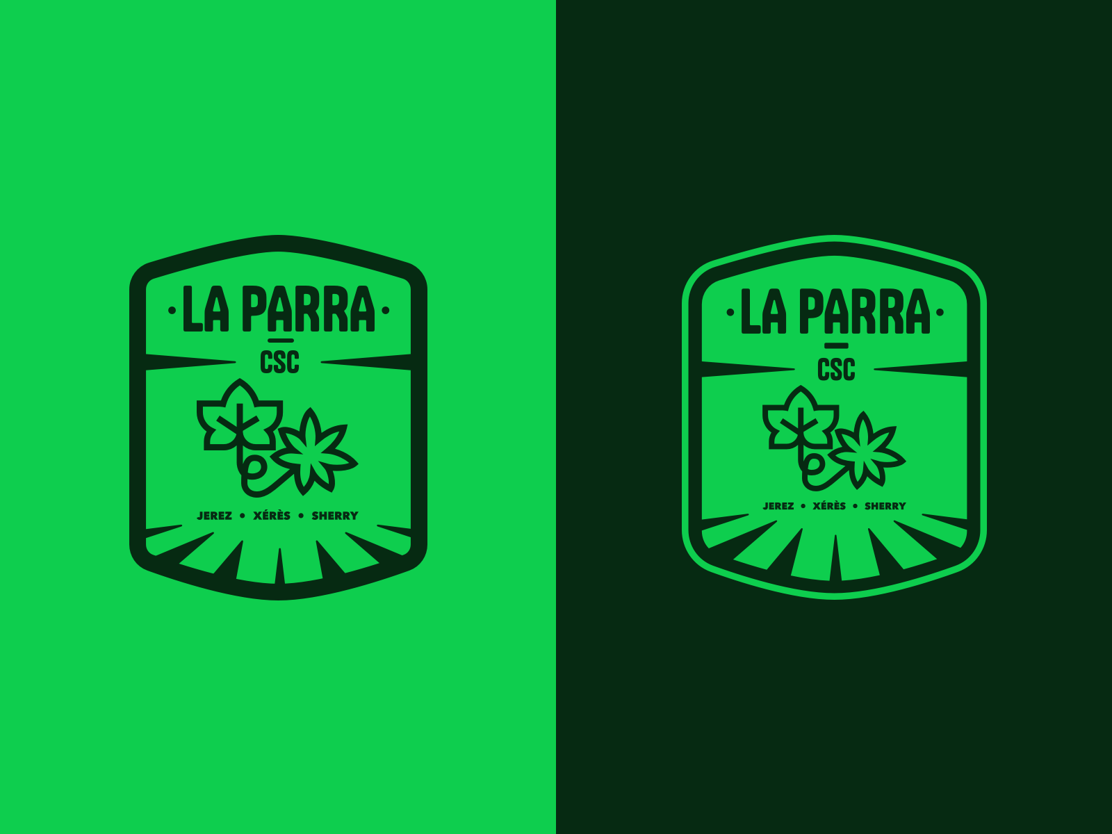
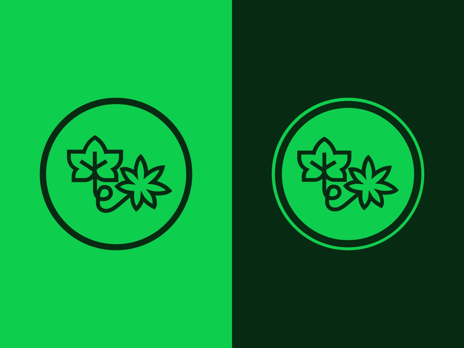
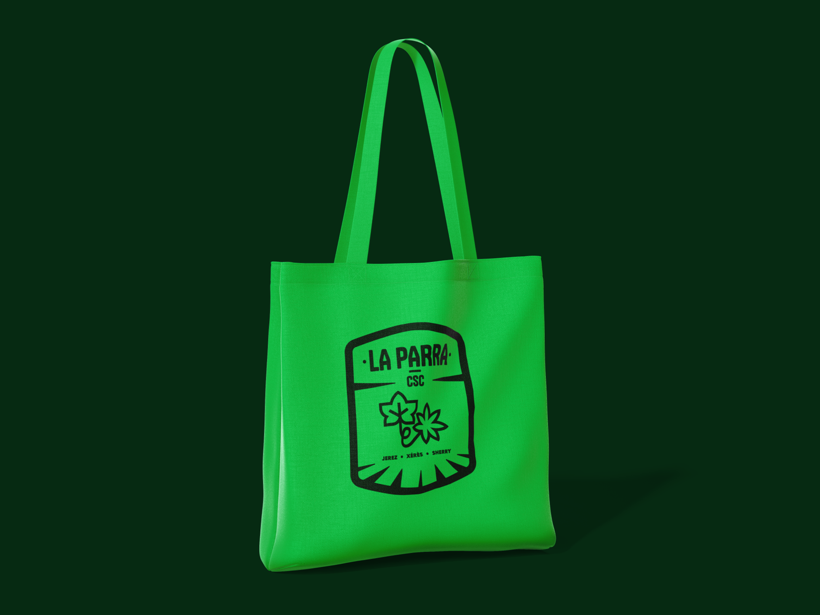
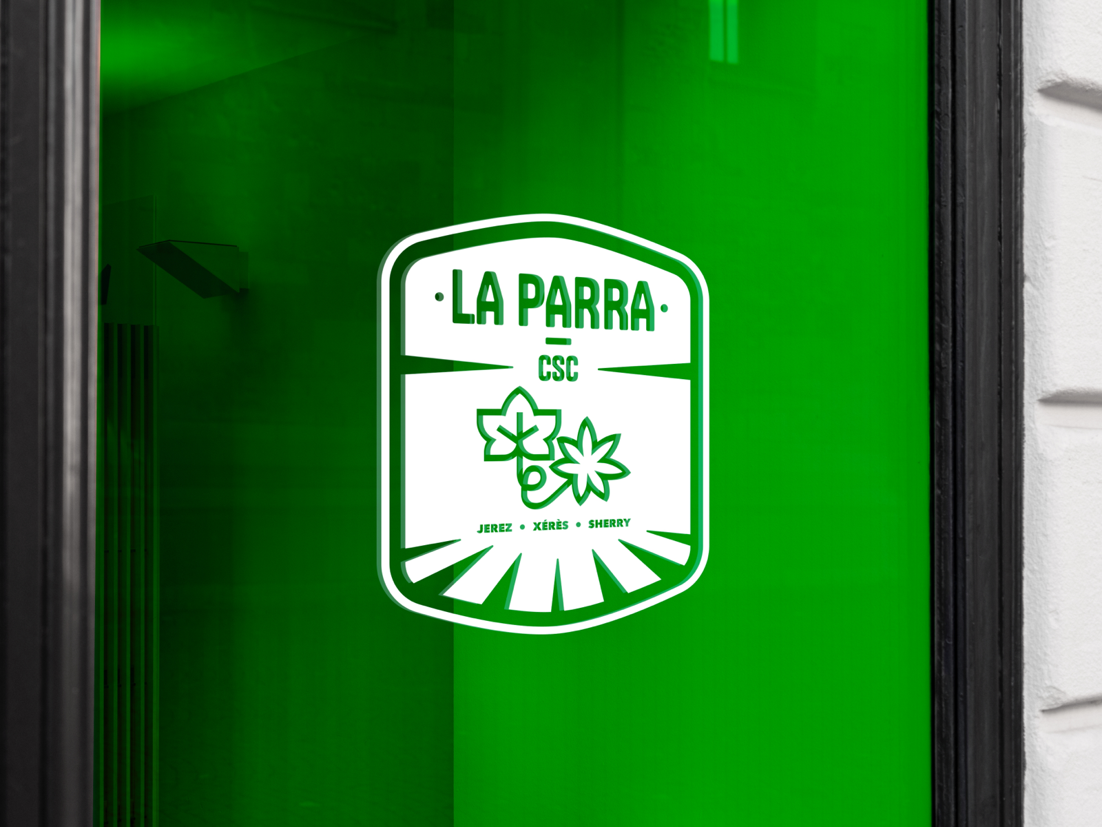
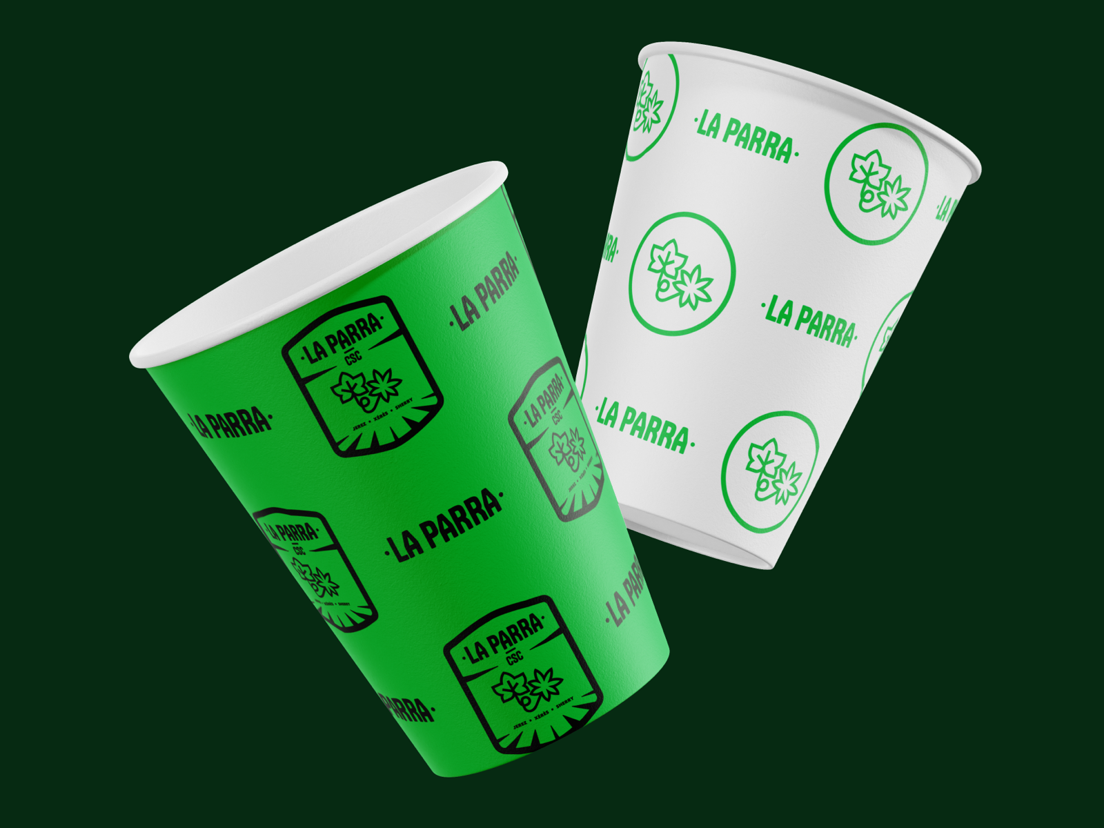
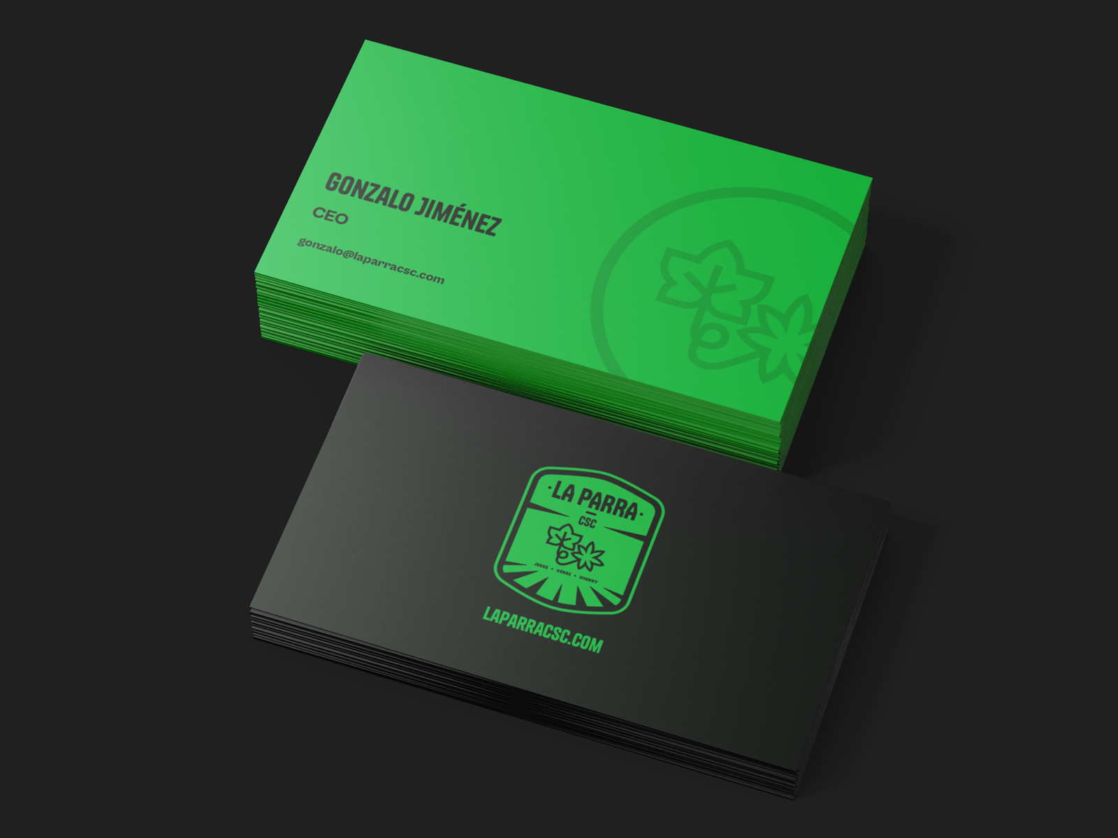
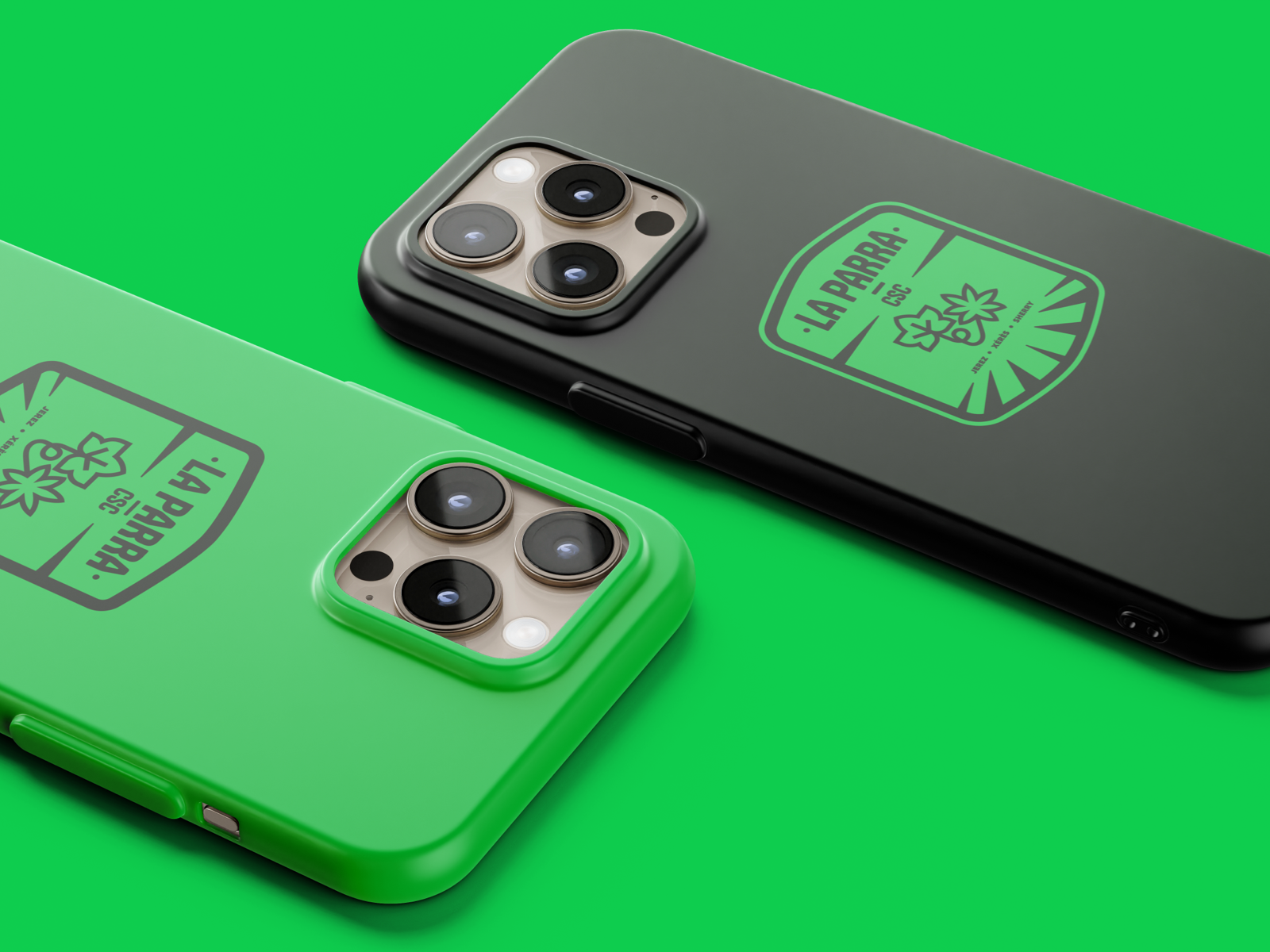
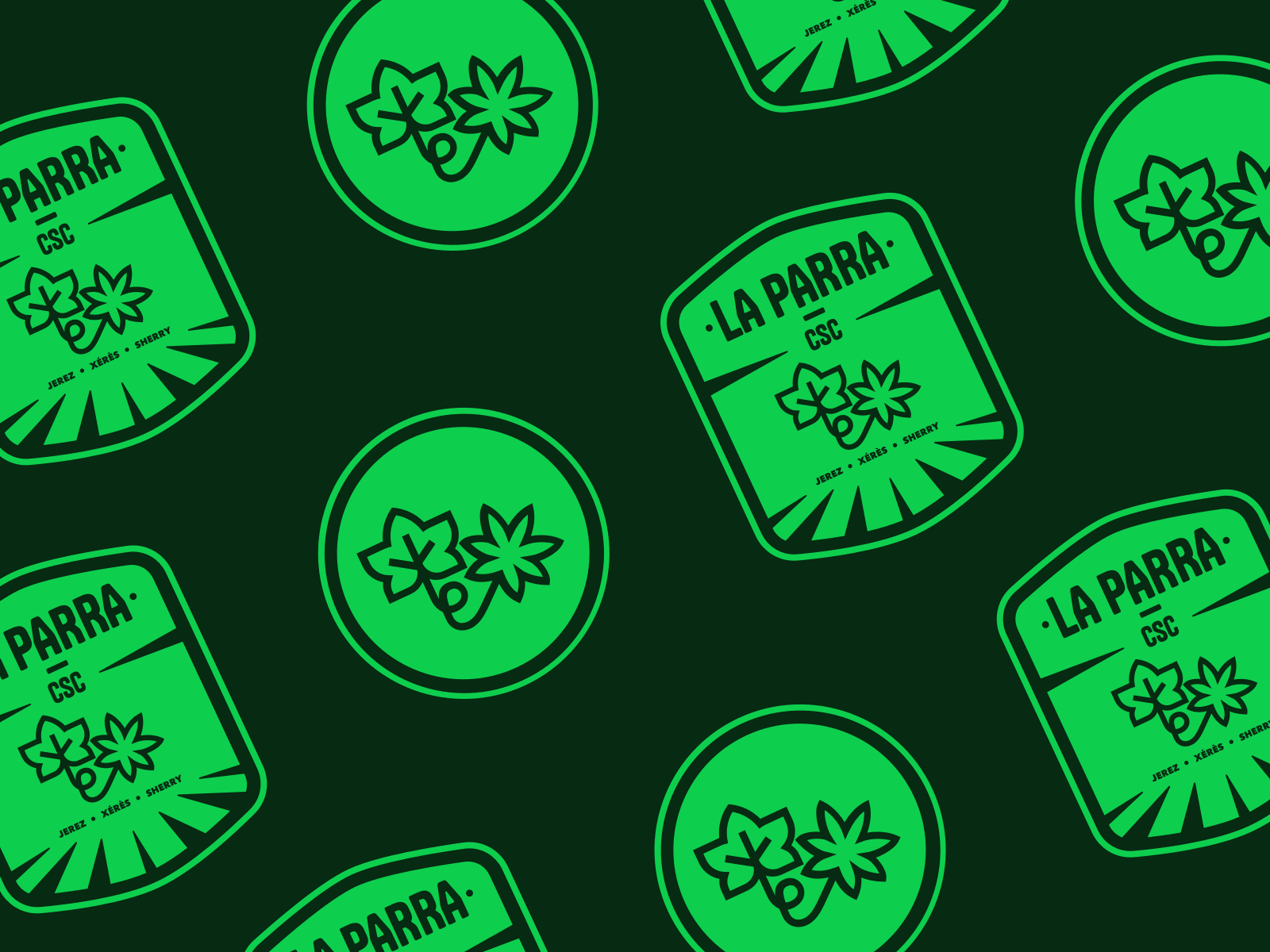
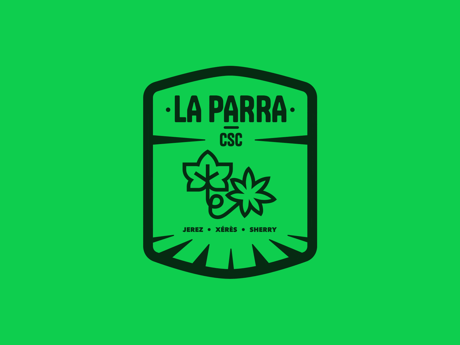
Through an iterative process, I explored typographic and graphic solutions, arriving at a custom logotype complemented by a symbolic illustration of a grapevine (parra in Spanish), whose organic shapes subtly hint at cannabis leaves without being literal. The identity also incorporates a secondary emblem that works as a seal for merchandise and signage.
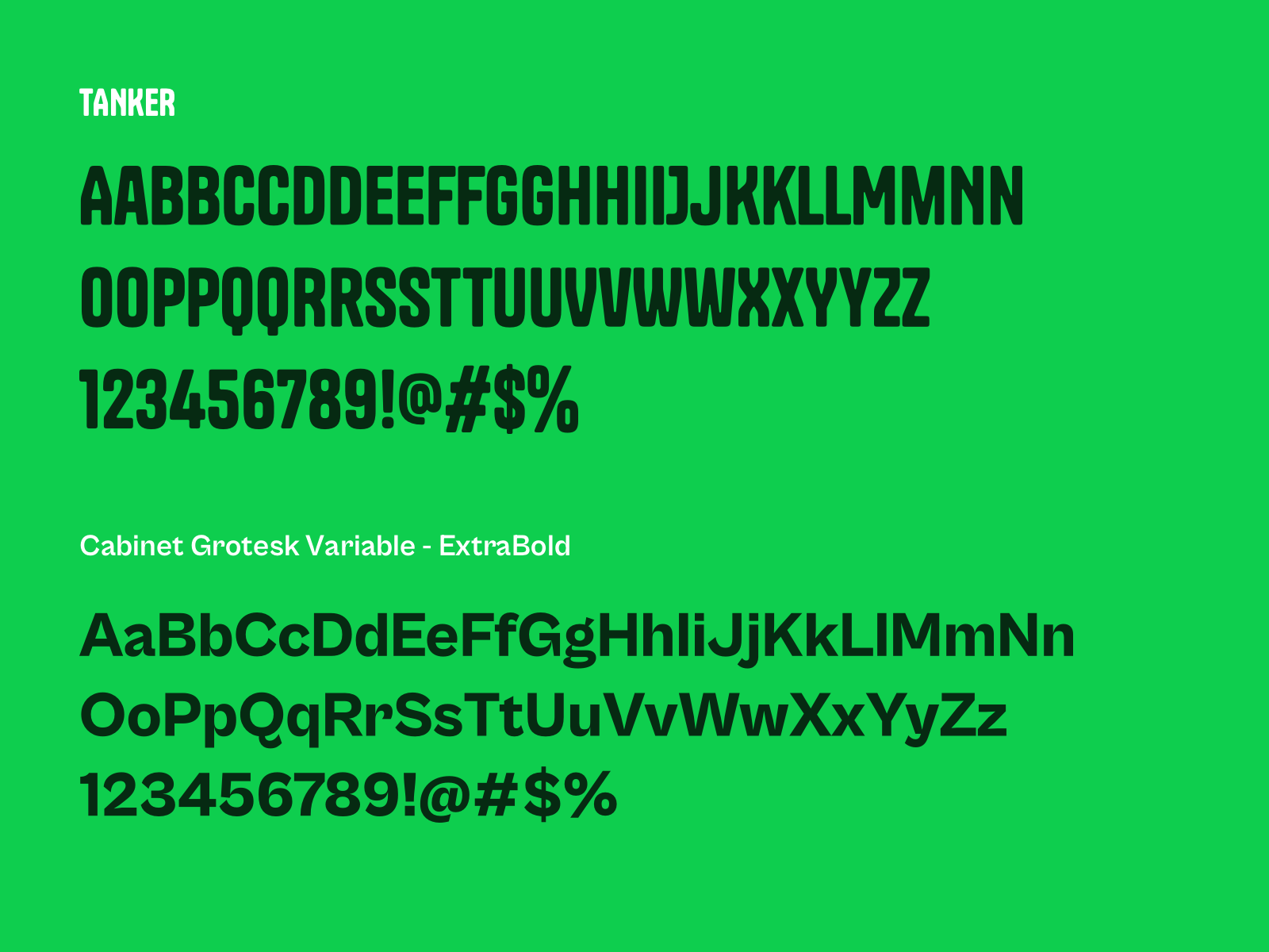
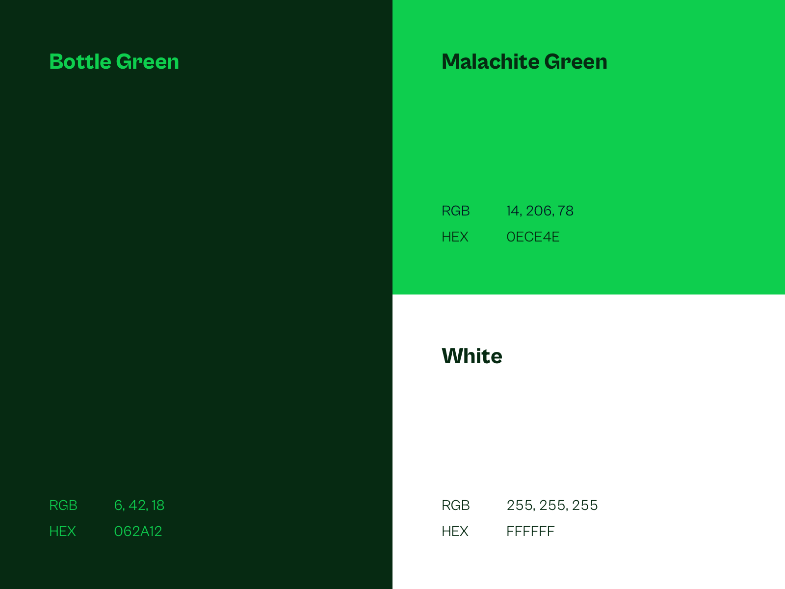
The color palette — rooted in earthy greens, warm neutrals, and deep clay tones — evokes the natural surroundings of the region while reinforcing the relaxed and grounded personality of the club. The typography combines a modern serif with a sans-serif that feels contemporary yet timeless, adding to the approachable yet sophisticated feel.
This identity extends seamlessly across print, digital, and environmental applications, creating a coherent and memorable brand experience for members of La Parra CSC.
The Project